10 Things I Like & Don’t Like in NBA digital content
I love the NBA, and if you’re reading this you probably do too. If there’s one thing I love even more than the NBA, it’s digital content about the NBA. I’ve been maniacally monitoring the NBA’s online landscape all season long and I’ve gathered thoughts on some of the best & worst trends emerging in the everchanging digital zeitgeist. In an ode to the Zach Lowe classic feature, here are 10 things I like and don’t like in the NBA’s digital content world this year.
1) Don’t Like: The current state of quote graphics
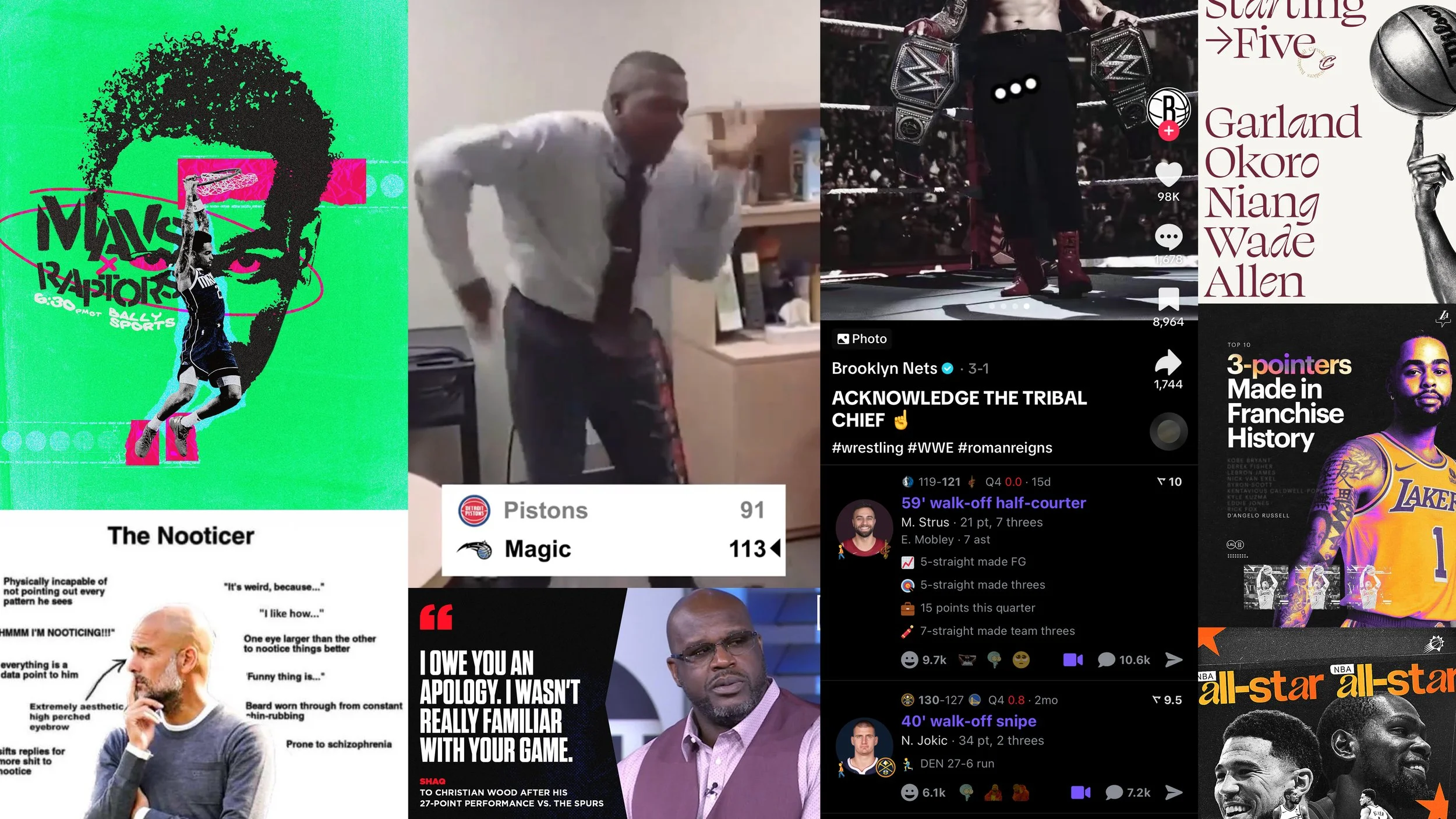
From roughly 2018 to 2023, we were living in a golden age of quote graphics and didn’t even know it. The formula was simple: NBA player says something outlandish, media accounts aggregate the quote with a simple graphic, graphic becomes an NBA Twitter meme overnight. This recipe delivered classics like “I Wasn’t Familiar With Your Game” from Shaquille O’Neal, “What Happened To The Game I Love” from Doc Rivers, and Vince Carter’s famed “I Got One More In Me.”
Somewhere along the illustrious history of quote graphics, these media companies realized something dangerous: they were unintentionally creating all-time memes, all of which had their logo on them. After this epiphany, they began forcing these quote graphics. Every media entity realized the value of having their logo on an evergreen meme image, creating an environment where everyone is HUNTING for the next big meme, creating quote graphics left and right for soundbites that don’t truly deserve them. Nowadays, NBA fans can’t scroll their timeline on any app without seeing a quote graphic once every three or four posts. A majority of these quotes lack any substance, nothing more than a cringy photo of the player and a brand’s logo in a prime location, all in pursuit of virality.
While I’ve been meaning to write about the decline of quote graphics for a while, there was one graphic that recently graced my timeline and expedited this writing, from TheDunkCentral. Not only does this graphic feature a dry quote with an ugly photo of my guy Jalen Brunson, but five wordmarks/logos for other companies. If any image epitomizes the current state of quote graphics, it’s this: a once-beloved meme format fallen down a capitalist hellhole, no end in sight. Let’s pour one out for the 2018-2023 quote graphic golden age, because it’s never coming back.
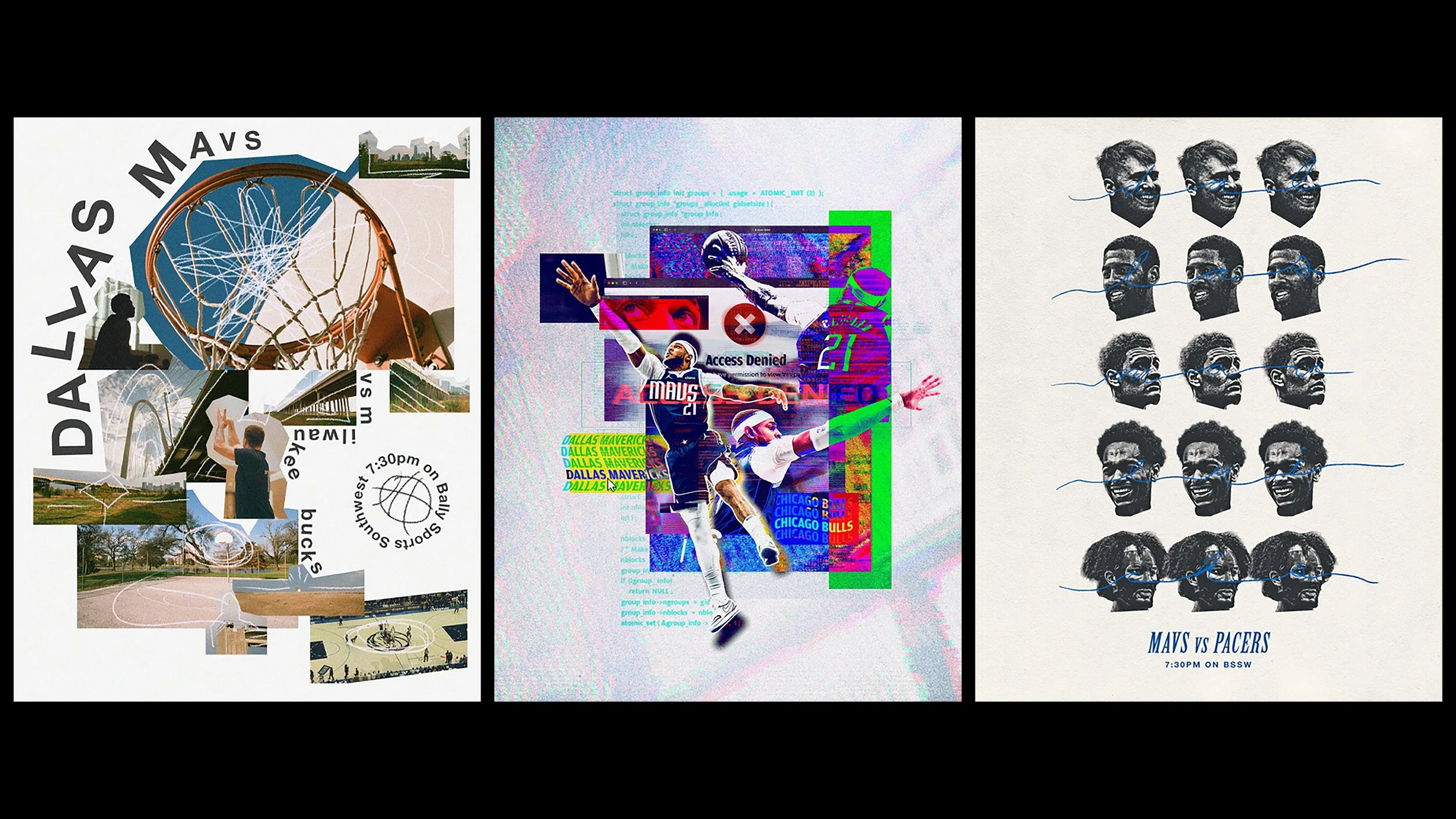
2) Like: The Dallas Mavericks’ gameday graphics
No two Dallas Mavericks gameday graphics look the same. As part of their Posterized commemorative series, each Mavericks gameday graphic is crafted by a local artist in the Dallas-Fort Worth area (DFW), providing a unique flair for every game on the calendar. These graphics are later sold as physical prints, with all proceeds going to The Mavs Foundation. This is nothing new for the Mavericks, as the program has been in place since the 2019-20 season, but the quality of these graphics seems to increase every game.
There’s a website tab that houses all of the Posterized graphics since 2019, but it hasn’t been updated this year (yet). The Mavericks have also posted hour-long YouTube breakdowns of Posterized graphics in the past, giving these creatives much-deserved recognition and letting fans in on the behind-the-scenes process. The main takeaway here: the Mavericks found a way to make each game day feel supremely special on social media and empower the DFW art community in the process. Plus all of the art is stunning. It’s awesome.
3) Don’t Like: The New York Knicks’ All-Star campaign
To help get their guys to the All-Star Game, almost every NBA team spruces up their visual identity for their All-Star voting campaign, with some even establishing an entirely new look & feel for the voting period. While most teams simply leaned into a more elevated, shiny and flashy version of their preexisting visual package, the Knicks went an alternate route and jumped into a distinctive new theme: galaxies, stars and space, a play on the word “star,” as they frequently claim the “brightest stars shine in New York City” on their digital deliverables.
The campaign launched with this promotional video, featuring a grizzled astronomy professor who spends two minutes reading a dull script about each star on the Knicks. This video was the first instance of the Knicks trying to establish astro-themed nicknames for their star players, as the professor introduces fans to JR30 and JB11, along with the short-lived RJ9, IQ5 and QG6. For the next month and a half, the voting campaign continued with constant galaxy-themed visuals and weak attempts to get those new nicknames to land. In the most annoying feature of all, the Knicks slapped a giant “VOTE” wordmark in the corner of every in-game video clip during that time, distracting from the action and limiting the shareability of each moment.
I’ll give them some credit: from a design and production standpoint, most of this campaign was well-executed. The videos, graphics and animations were professional quality; nothing felt mailed in. It was the galaxy concept that didn’t resonate with me and many fans I spoke with, reflected in the engagement metrics for most of the content shared. I don’t want to bore you to death with numbers, but the aforementioned launch video barely eclipsed 200 likes and didn’t “wow” anyone in the quotes or replies. One person wrote, “I thought that was Santa for a sec.”
When NBA fans think of All-Star Weekend, astronomy professors and space constellations are the last things that come to mind. The idea was flat-out corny and forced – had this level of visual execution been performed on a more digestible concept*, something with preexisting intrinsic value to fans, perhaps Jalen Brunson would’ve edged out Damian Lillard for the final starting spot in the All-Star Game.
*The Suns used an elevated version of graphics their fans were already used to, complete with a handful of new tropes and a refined emphasis on oranges and yellows. Here are some examples; more words on the Suns soon.
4) Like: The Orlando Magic’s victory celebrations
I could do an entire article about the Orlando Magic’s digital evolution this season, and how fans interactions with the long-dormant franchise set the standard for official team content in 2024. While there are many moving parts to Orlando’s social media presence these days, I want to focus on a newfound hallmark of theirs: victory celebration videos.
After every Magic win – or “Wagic Win,” as they say – they post a silly, dance-y, high-energy video with a screenshot of the game’s final score pasted front and center. While each clip is unique, the audio certainly isn’t. For each video, the Magic attach their 1987 theme song . . . and it’s a BANGER.
The song isn’t the only star of the show here, though: each video is hand-picked to suit the opponent and outcome of the game, and many are stitched together with game clips and other meme-y footage to create an overstimulating celebration for each win. It’s hard to describe the wide range of videos in words, but it’s clear that whoever’s crafting these edits has their finger on the pulse of Gen Z internet culture. The videos are always culturally relevant and frequently make me think “Wow, the Magic used THAT video!?”
These have become such a big hit with Magic fans (and NBA fans in general, to be honest) that the Magic have started posting subtle tweets like “y'all wanna hear the song?” right before a game ends, receiving a roar of elated quote tweets and replies each time.
5) Like: The Brooklyn Nets’ TikTok account
When a basketball team is as depressing as this year’s Brooklyn Nets, their social team is dealt a daunting task: keep your fanbase engaged for all 82. The Nets have completed this task with flying colors, and while their digital content is tremendous on all platforms, I’m issuing a ton of credit to their presence on TikTok. The Nets have spent all season tip-toeing what’s appropriate for a professional sports franchise to post on TikTok, making for several entertaining – and questionable – moments.
If you’re not a frequent TikTok user, many of the Nets’ TikToks will make no sense. If you’re chronically online and in your 20s, you’ll get a kick out of every single one. While there is a decent portion of standard basketball content, a majority of the Nets’ TikToks have absolutely nothing to do with their on-court product, often featuring nods to historical meme culture, trending sounds or just a simple recreation of a popular TikTok with a photo of Mikal Bridges.
Similar to the Magic’s post-victory videos, the Nets have demonstrated an extreme understanding of TikTok culture, whose landscape changes faster than any other social media. It takes an acute understanding of the platform to produce the volume and quality of content Brooklyn has this year.
6) Don’t Like: The New York Knicks’ gameday graphics
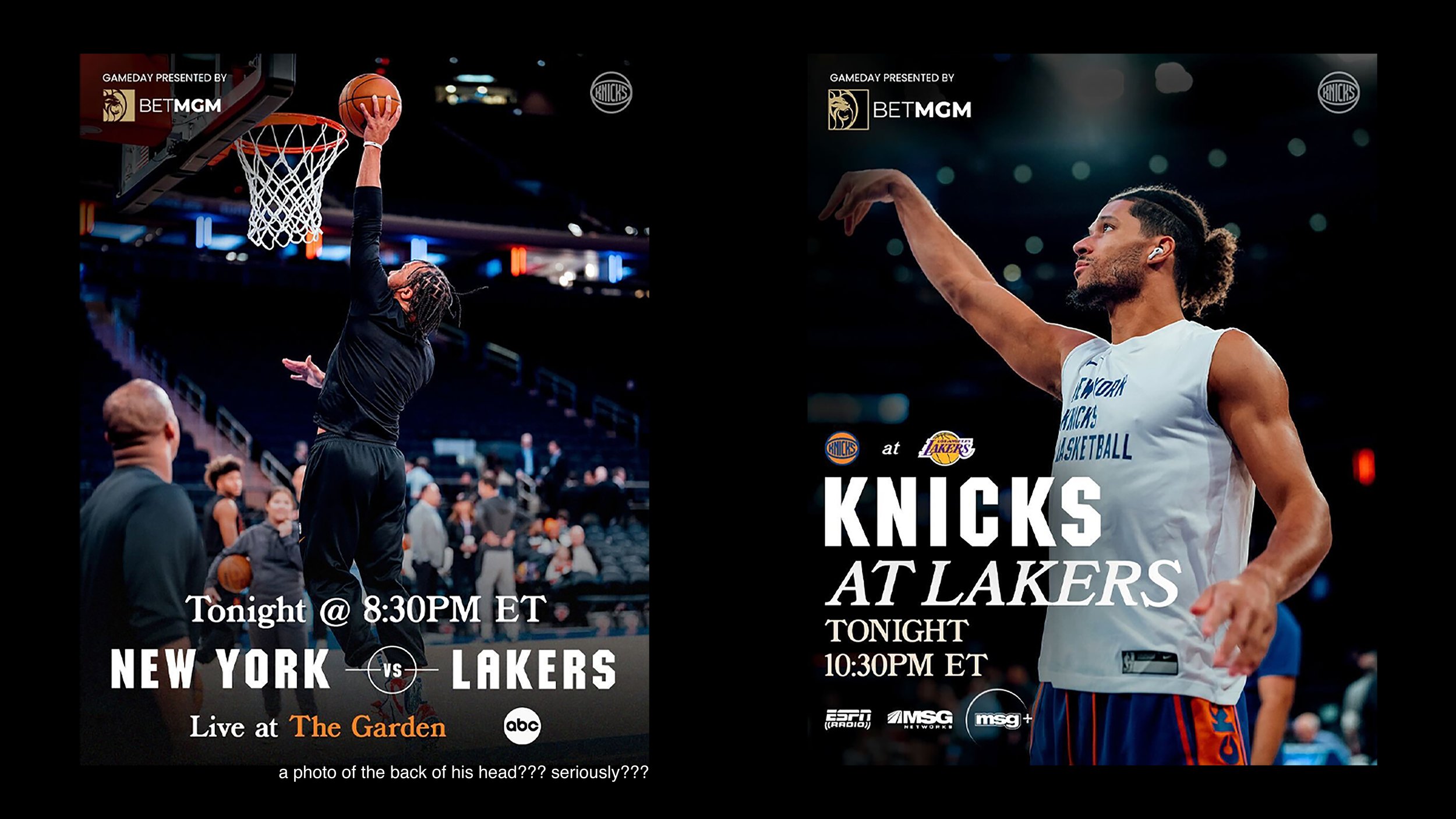
Confession: I have post notifications turned on for the Knicks’ Twitter and Instagram accounts. That means that every gameday morning, I’m one of the first people to see what the Knicks prepared to remind fans to tune in. It also means they were bound for a double feature on this list. Unlike the Mavs, every Knicks game-day graphic looks the same.
Each is built around a photo almost always taken during pre-game warmups, often wearing sweatsuits, not their easily recognizable in-game uniform. These warm-up photos usually lack emotion since they don’t take place during high-intensity moments. They also lack visible jersey numbers and the iconic “New York” wordmark across the chest, diminishing their ability to resonate with casual fans. Sometimes they’ll confuse the game’s location by using a photo that’s clearly from Madison Square Garden for a road game.
Using warmup photos for graphics is questionable for a team with as much roster turnover as the Knicks. Many casual fans haven’t yet memorized the faces of new players, and photos with jersey numbers have stronger inherent value and directly lead to more engagement. Also, in-game action photos are generally more engaging than pregame warm-up shots.
The photo then receives a simple text lockup, which is where the home & away versions of these graphics begin to differ. On the away game template, the text is simple and functional: “Knicks At Cavaliers,” for example, followed by the start time and broadcast information. On the home game template, the text is different: “New York vs. Cavaliers,” followed by the start time and broadcast information, along with an extra “Live At The Garden” wordmark. While this does sound cool, it rarely appears elsewhere among the Knicks’ digital deliverables and feels forced.
My biggest pet peeve with these is this inconsistency with their game matchup text structure. For road games, it’s always “Mascot vs. Mascot.” That’s great. For home games, it’s “City vs. Mascot,” which is oddly inconsistent and drives me crazy every time. “City vs. City” or “Mascot vs. Mascot” is always going to roll off the tongue better than a mixture of both, and I can’t remotely fathom why this choice was made. Have you ever heard somebody say they’re watching the “New York vs. Lakers” game?
The captions that accompany these graphics arerobotic and stale; they feel like they were created and scheduled weeks in advance. There’s rarely any copy that relates to the broader context of the game and frequent leaning on dull lines like “Game __ of 82” or “Let's Go Knicks!” Earlier this season when the Knicks won eight in a row and the fanbase’s vibes were at a fever pitch, the resurrected rival Pacers came to town. Instead of posting something relating to the high-intensity game, the Knicks captioned their “New York vs. Pacers” graphic with an uninspiring “Knicks. Pacers. Tonight 🔒.”
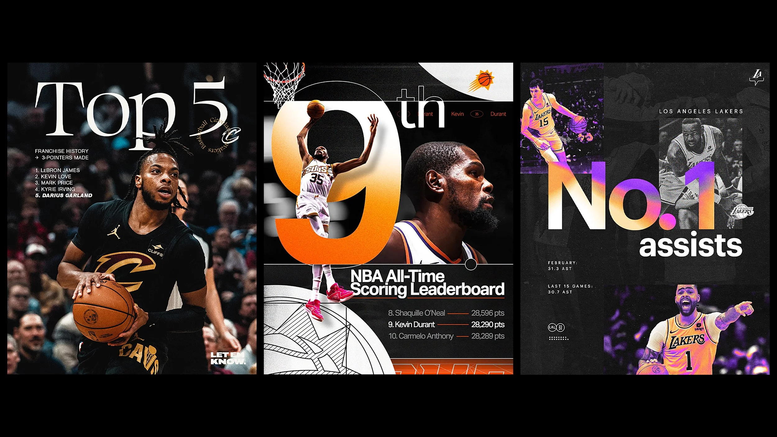
7) Like: The visual identities of the Cavaliers, Suns & Lakers
The Suns have been my favorite NBA team Instagram follow for a few seasons. Their visual identity is built around a series of gradients, easy-to-read sans serif typography and an armory’s worth of logos, emblems and geometric shapes. The Suns’ wide range of visual assets gives their designers plenty of breathing room when creating pieces like stat graphics, milestone celebrations and announcement images.
There’s also a level of care and passion that oozes out of the Suns’ graphics, as templates are rarely recycled and you can *feel* the effort put into every single piece. As a bonus, the Suns have a slightly different visual theme for their City Edition El Valle nights which matches the uniforms perfectly and gives those games an extra-special look and feel.
Next is the Lakers, the gold standard in NBA digital design for years. Their visuals get a slight refresh every season, but their minimalistic and photo-centric approach remains consistent. This season they’ve debuted an awesome purple-and-gold thermal photo treatment that gives their photography a slight sense of elevation without diluting the beauty of each shot. Combine this with their modernist typography and frequent experimentation with structure and you’ve got a visual theme that perfectly suits the 17-time champions.
And finally, the Cleveland Cavaliers, who host the most avant-garde design theme in the Association. Many of the Cavs’ graphics are built around their signature typography, defined by gothic fonts and spontaneous italicization. The Cavs love to build their typography into high-energy action shots from games, always going the extra mile by placing text behind subjects and adding a sense of depth to each image.
Two of my favorite pieces of Cleveland’s visual set are their “Home To The Wine & Gold”-stacked wordmark and their “Cleveland Cavaliers Basketball” circular wordmark, both of which are usually locked up with their classic “C” logo. These appear on their injury updates, starting five graphics, event announcements and more, all of which feel extremely fresh compared to the Cavs' visuals of old while elevating the classic logo.
8) Like: NBA teams embracing NBA Twitter
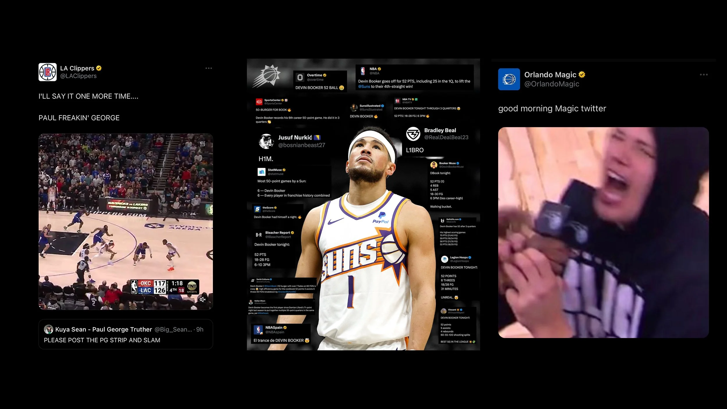
I don’t have a specific team to credit here, and I’m going to include examples from across the league, but I’m super happy to see numerous franchises finally embracing the robust online universe that is NBA Twitter.
For a while it felt like teams were deliberately ignoring the hysteria that takes place every night on the bird app, and this season feels like the first where teams are breaking that thick sheet of ice. This digital acceptance comes in many forms, some of the most common quote tweets of credentialed & independent media accounts, incorporating tweets into graphics and replies to fans and media. I’ve included some of my personal favorites in the image above, and I’ll let those do the talking.
9) Like: Jalen Williams’ TikTok account
Gen-Z readers, Jalen Williams is truly one of us. J-Dub’s TikTok feed covers all the bases: highlight clips, photo dumps, cinematic game footage, dance videos, mixtapes and much more. I have a feeling Williams is getting some help from Oklahoma City’s digital team on some of his content, but I’m confident that he’s making a lot of it on his own. He frequently uses CapCut editing templates, which have become a staple of teenhood video production and tend to dictate trends on the TikTok landscape.
J-Dub, like myself, is also a chronic TikTok reposter. His reposts consist of clips from his favorite movies and shows, mixtapes of NBA legends, highlight tapes of himself and his teammates and even meme videos about his love life. He’s totally open about his personal life, hobbies and interests, intensifying his connection with his fans.
10) Like: The Real Sports app
I’m cheating here. The Real Sports App isn’t *really* digital content, but it’s close enough, and it’s so f***ing good that I needed to get it in here.
In case you’re out of the loop: Real Sports is a fairly new mobile app that combines the best parts of NBA Twitter with the greatest statistics app on the market. It’s also got an entire universe of digital trading cards, virtual currencies and all sorts of fun stuff to keep users engaged, but I’m just here for the stats, memes and moments (I’ll explain).
The stats on the app update faster than any of its competitors, including ESPN, Yahoo and Bleacher Report – even faster than the line-in cable broadcast at my parent’s house, meaning I’ve had to put my phone away for the final few minutes of some Knick nailbiters.
The stats are organized in a well-thought-out manner, as the user interface is extremely easy to read with easily accessible information. Nearly every corner of the app can be configured to a user's liking, including its robust notification center. I get buzzed whenever Immanuel Quickley has a double-double or Francisco Álvarez knocks one out of the park.
While all of this stuff is amazing, Real App’s flagship features are its “Real Moments” and the chatrooms that accompany them. Every game is broken down into individual moments, each with an AI-generated headline that describes what happened on the court (or field). Each “Moment” is then automatically scored with a rating out of ten, factoring in variables like the game’s score, player performance and more; the highest scoring “Moment” this season was Max Strus’ fullcourt game-winning buzzer-beater, which received a perfect 10.0.
Each “Moment” is paired with a chatroom, full of wild fans who hysterically react to each play in real-time. When I’m not by the TV for a League Pass night, I often find myself lying in bed on the Real App watching and chatting with thousands of fans doing the same. I promise this isn’t a paid promo. I don’t even know anybody who works for Real. This app has completely changed how I consume sports, and you’ve got to download it to understand it.

